DeVisualise Add Fave Search
Not Logged In
0
Your Username:
Your Password:

[ sign up | recover ]

Creativity
by Bia's designs

previous entry: Blend

next entry: more awards

themed lims 6 + randoms

06/06/2009


Icons


I broke the left button on my mouse. Well, I didn't do it. It broke itself somehow. Anyway, I need to try and get more into creating. I need more challenges or something. I don't know. Maybe I'm just uninspired lately.

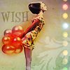
I guess I'll post my last icon for ~themed LIMS:


+2/-0= +2


For

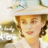
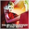
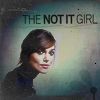
I like the shadowing in this photo and I like how "not it" is bolded. The colors in this icon are nice because they aren't very bright, but they are still bold.

The main reason why I like this icon is that it is original and unique. I love the shade of bluey green in the background, the font used and its placement, the bolding of 'NOT IT', the brushes used and the colouring/sharpening of Keira herself. The whole thing just fits together seamlessly and I enjoy it very much. =)

-------


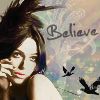
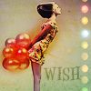
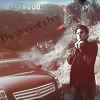
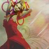
And below some other alternatives for this past challenge as well as other random icons I made for no reason.


[01]
[02]
[03]
[04]
[05]
[06]
[07]
[08]
[09]
[10]
[11]
[12]
[13]
[14]
[15]
[16]

previous entry: Blend

next entry: more awards

0 likes, 9 comments

[ | add comment ]

Add Comment

Add Comment

Please enter the following WHITE digits in the box below.

Confirmation Code

I like the one you turned in and #4

[Love Bipolar IncStar|0 likes] [|reply]


ooh i love numbers 4, 5 and 6. And I really liked your submission.

[eye candy [designs]Star|0 likes] [|reply]


OOH - YOU DID THAT ONE! THAT ONE ENTERTAINED ME, YO! YOU MANAGED TO MAKE HER LOOK LIKE A GAWKY FREAK, SO THE 'NOT IT GIRL' SUITED PERFECTLY! WAS THAT THE PLAN?
***
CLICK MY EGGZ && BABY DRAGONZ, YO!
Adopt one today! Adopt one today! Adopt one today! Adopt one today! Adopt one today! Adopt one today! Adopt one today!


[ LADY PUCKStar|0 likes] [|reply]


I really love the icon you submitted. I was surprised it didn't get more positive votes! I thought it was going to win!

So impressed. I look forward to your submission this round.

.jessa♥

[immortalized artisteStar|0 likes] [|reply]


I LOVED your themed submission. I really thought it was going to get more positives than it did. I love the colours in it, the bolding of the "not it" (like most seem to like lol) and the flower texture/brush in the bottom corner. I really like the 4th, 5th, and 9th ones too. I want to use the 5th for something, but I don't know what... is the line of dots a texture?
♥ -

[Radiant DesignsStar|0 likes] [|reply]


I can't believe yours didn't get more positive feedback. It's amazing!

[Pointless;DesignsStar|0 likes] [|reply]


it was really hard for me to choose between yours and teresa's!

[& icons.|0 likes] [|reply]


RYC: I thought that too (about the negative comment - that it wasn't really a reason for it to be least favourite but still...) and I did try and erase it because I remember thinking to myself "If only that brush wasn't over her arm" but clearly whatever I did didn't work because I can also remember thinking "oh just leave it you'll probably be out this round anyway"! lol!

[eye candy [designs]Star|0 likes] [|reply]


There are not words for my love for 5&6. Amazing.
& though I think 1 was the best choice for lims, I love what you did with all them & I think 4 is my favourite. I love that you were able to find a texture that didn't take over the curtains

[Cherry Seven ExtrasStar|0 likes] [|reply]

previous entry: Blend

next entry: more awards

Online Friends
Offline Friends