 as follows: as follows:
+2/-3= -1
For
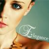
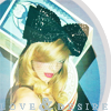
♥ Color is amazing, love the font and how they had it curve with her shoulder. The icon is elegant.
♥ When the page loaded, this was the one to first catch my eye. The teal color in the background and her eyes were appealing, the crop is eye-catching, and the icon has a very pulling quality. Best icon I've seen in this round.
Against
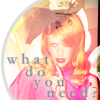
♥ I find it kind of bland, the artist could have done more to it.
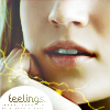
♥ I actually quite like how this icon has been coloured; I love the emphasis on the green hues. However, it seems the least integrated of the icons, and that is because the text looks out of place. I think the 'E' is too big, and that the text is too close to the model, leaving an expanse of space above. I think it would be improved if the text were moved up into that space, and made less 'obvious', by using a smaller, more suitable font.
♥ Althought all were great it was so hard to choose the worst but #2 just doesnt seem like a lot was done to it? like they cropped the picture added a dark overlay and some words.
My Thoughts
I liked this icon. I LOVED this icon. I l loved the shoulder crop and I didn't want to overpower it with a texture. that is all. 
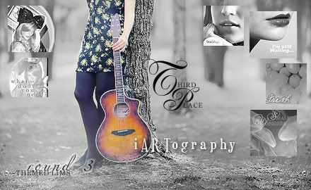
iARTography: icons 1A, 1D, 2B, 2E, 3C, 3F
1 + 2 + 7 + 6 + 8 + 3 = 27
My Thoughts:
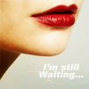
I am not surprised I took 3rd; the only round of icons I trullllllly liked were my last batch, the lips.
The second batch was fun, hec, all the rounds were. But I wasn't feeling creative in the abstract icon challenge, and I think my icons are a cop-out. I was trying to mimic my texture (but you can't clearly see the half circular texture, so it defeats the purpose). And they actually work better placed side by side. On their own, they do not stand well, lol.
Congratulations Bia, you earned a well deserved first place! you go girl!
And thank you all, for keeping me inspired, creative, and allowing me to get this far in a challenge I have never participated in before 
-Ambi |

 Loading...


 I voted for your "lips" one hehe


 I know! all of the icons looked amazing. That would have been a really hard vote.