+2/-3= -1
For
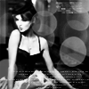
♥ this icon has been contrasted effectively: both the blacks and whites pop without being overbearing. The circle brushes and tiny text are also well-placed and help liven up the icon.
♥ for some reason it just stands out to me.
Against
♥ The idea behind it was great. I just wish the model's facial expression was clearer. Maybe keep the model a bigger size to see that becuse in this it looks to me like she is making a fish face.
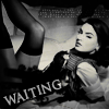
♥ Overall I do like this icon but I do feel it isn't of the same quality of the others. The girl isn't quite as sharp and for me this spoils it which is a shame because I do enjoy the composition.
♥ The light spots feel a little overpowering. Perhaps if the light spot were not over her head, and instead erased on that part and then have it all lowered in opacity it might look better. The image also looks a little blurry at parts. The tiny text feels out of place.
my comments
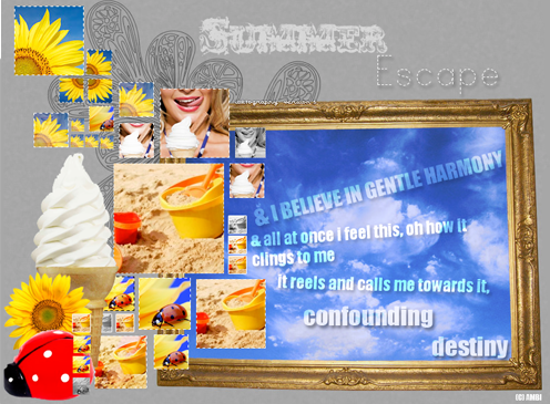
This challenge was hard for me. I loved the concept, but my creativity was lacking and I could feel it. I even contemplated using a skip (stressful week, a lot going on), but I told myself I wouldn't because I wanted to test my creativity.
Basically, I was going for light bubbles to come across horizontally to the right, and though I wanted them to be smaller, they didn't come out that way. Initially I made this icon:
But I wasn't liking that either. Oh well. I'm not too satisfied with what I made for this round, but who knows. Maybe others will like it?
+ icons
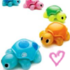
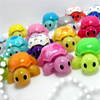
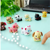
here are some random icons I made a few weeks ago, of "walkie bits" and "micropets" :)

 Loading...
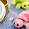


 .
.