| Layout Directory ~ Icon Directory ~ Battle Directory
guide - all my loving
REMEMBER THAT THIS IS ONLY A GUIDE. It is in order to help people with colourizations, not to tell people exactly how to do it.
The real way of making a colourization look good is to PLAY AROUND. Different blending modes, different opacities, different colours, etc.
OKAY, with that said, let's begin.
|
SKIN
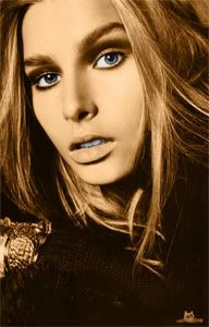
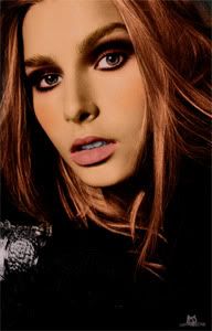
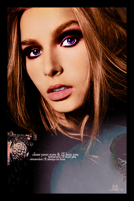
For my colourizations I ALWAYS start this way...
Using a black and white image, I make two layers (which I will discuss in a moment) for the skin. These two layers are FILLED with colour and LEFT FILLED for the entire colourization. I never erase these. I find it gives the colourization a natural base and makes all the other colours look more true.
So for the skin, I use two layers:
One colour layer right over the base
One soft light layer over the colour layer.
The colour layer is a darker skin colour and
the soft light layer is a lighter, less orange skin colour.
You have to play around with this individually for each colourization, the same colours don't work with every picture. Also, PLAY WITH THE OPACITIES, ALWAYS.
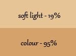
For this image (I'm providing colours because this part is hard and needs an example) I used:
You'll notice these colours look awful as skin, this is what I mean by playing around. I have about 5 layers through this whole colourization to make the skin perfect
colour layer: #d5a26b(I usually go more orange than this) - opacity 95%
soft light layer: #e7c495 - opacity 19%

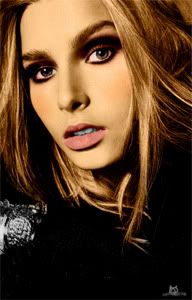
EYES/TEETH
This is a crucial step that EVERYONE should ALWAYS do, no matter the method you're using.
I make another layer on top of the skin layers and, using WHITE, and a small brush, fill in the eyes, whites and coloured part and teeth with white. SET THIS LAYER TO COLOUR.
DUPLICATE layer, set to softlight, reduce opacity significantly. From this layer, erase the white from the coloured portion of the eye.
MAKEUP, EYES
Next I do blush. I just use a dark red on SOFT LIGHT with reduce opacity.
LIPS: I always always always (this will sound weird) use a 10% multiply DARK PURPLE layer for the lips, and follow that up by a soft light, opacity reduced PINK layer
EYE MAKEUP is completely up to you, I used brown on colour, duplicated the layer and put it on soft light. I also, when I made this layer, guassion blurred it to make it softer.
EYES: USUALLY, I just make a layer put it on colour and fill with with w/e colour and reduce opacity accordingly. This one, I was playing around with and ended up doing the eyes with curves.
CLOTHES: her clothes were just black, so layer set to COLOUR filled with black for her clothes
it was not nearly as black as I wanted, so i used a levels layer to up the blacks.
HAIR
AGAIN, i use a colour layer AND a soft light layer for the hair.
They both us the same colour - a dark brown, and both have reduced opacity (colour: 64%; softlight: 88%)
People always have a lot of trouble with blonde hair, so here's my opinion.
I use a colour looking like: #fbf5c2
put this on the hair on a COLOUR layer, this will make the hair green. Which isn't what you want. Reduce the opacity A LOT. so that it just colours it a little bit.
Duplicate this layer, set it to softlight and then raise the opacity until the hair looks realistic.
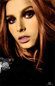
OTHER CORRECTIONS
I started working on the skin here: I used a layer set to multiply with #e2ccd1
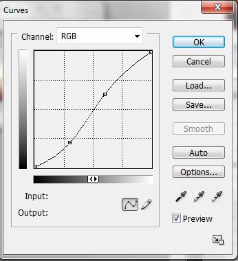
Also for skin, I made a curves layer with a curve that looks like this:
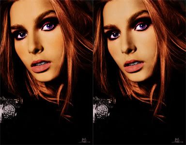
Then the skin was too orange, so I copy-merged and using the sponge tool set to desaturate and low opacity, i started making the skin lighter, to look more natural
HOW TO SHARPEN
I've been using a new sharpening technique that is VERY effective.
Make a new layer, copy merge your image... now to go to Filter>Other>High Pass
Reduce the number til you can JUST see the outline in the grey (it's about 0.4 with this image) Set this layer to LINEAR LIGHT.
There ya go
CORRECTIONS CON'T
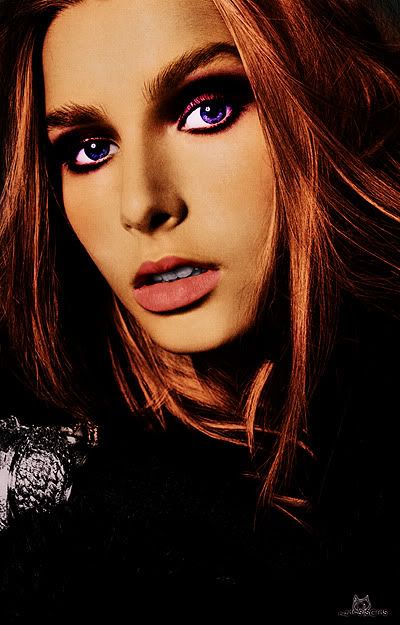
I thought the hair was too red, so I added another brown layer to make it more brown
Text, font, etc.
FINALLY, I put a layer over top the whole thing, light pink, set to soft light and opacity reduced. This makes it look more... I dno, realisitc somehow. lol.
There you go. Enjoy.
|

 Loading...


 I like it.