|
Oi
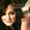
So, another challenge of ~themed LIMS has come and gone and I am still around. Here's the goods.
For
the colours in this icon are well-balanced and deep. Leighton is coloured well, and her skin tones are complemented by the green overlay. The text (although the word 'freedom' appears a bit pixelated) suits the icon, and the brush stroke texture on the right makes it complete.
Against
It doesn't look like much was done to the coloring of the icon. The text brush looks as if I was just added to have something more on the icon. It's a bit randomly placed & it's hard to read freedom.
not sure what's happened to her face. looks like a contrast layer or a colouring layer gone wrong. it's blotchy. it looks like the image has been made slightly darker than the original image and that's it. the crop is ok. the font doesn't really suit, it's slightly difficult to read.
I don't really know what to say. I sound like a broken record, but I actually kind of liked this one. The second comment...uhmm...anyway. Whatever. The only thing I can't stand is when people leave comments like "they didn't do anything to this icon". Why would someone enter an icon challenge (or any challenge for that matter) just to crop a picture and leave it at that? *shrug* ANYWAY it doesn't really matter, criticism is criticism. I wish there were more constructive comments like "you could have done this maybe instead to improve", you know? Oooooh well. 
|

 Loading...
 I didn't vote this round but I think maybe the 2nd comment about the blotch is her right cheek is quite shiny; the only thing I'd change about that is trying to take away the shine of that cheek imo. ^___^

 I usually try to do a "do this instead of that comment" whenever I vote but sometimes it's hard to pin WHY I don't like a certain icon and my PS skills aren't THAT great for me to do that kind of comment all the time. XD There's a reason why I don't do these kinds of challenges. XD

 i didnt vote this round but i like your icon and im glad youre still in!